
Curtains are one of the most underrated “big impact” upgrades in home decor. People often treat them like an afterthought—something you buy quickly after moving in—then wonder why the room still feels unfinished. The truth is, curtains do much more than cover a window. They control light, add softness, improve proportions, create privacy, and can make your ceilings look taller and your windows look bigger.
The good news: you don’t need a designer budget to get curtains right. You need the right measurements, the right placement, and a clear idea of what you want the curtains to do in your space. This guide will walk you through everything: choosing curtain types, selecting the right fabric, picking colors and patterns, measuring properly, hanging them like a pro, and styling each room so it looks intentional—not “temporary rental.”
Why curtains instantly make a room feel more “finished”
Curtains improve a room in three main ways:
- They soften hard lines
Most rooms have hard edges: walls, windows, floors, furniture corners. Curtains add softness and flow. - They enhance scale
When hung correctly, curtains make windows look larger and ceilings appear higher. - They create a cohesive layer
Curtains tie the palette together because they’re a large visual surface—like a rug.
If your room looks good but still feels incomplete, curtains are often the missing piece.
Step 1: Decide what you need curtains to do
Before you choose fabric or color, decide the purpose. Different rooms have different needs.
Ask:
- Do I need privacy during the day?
- Do I want blackout for better sleep?
- Do I want to soften bright light but still keep the room airy?
- Do I need insulation (heat/cold)?
- Is this mostly decorative (a finishing touch)?
Your answers will guide everything: fabric weight, lining, and style.
Common curtain goals (and what to choose)
Airy and bright: sheer or light-filtering panels
Private but still bright: semi-sheer or light-filtering with enough fullness
Dark and cozy (bedrooms): blackout or room-darkening
Temperature control: lined curtains or heavier fabric
Mostly decorative: fabric that matches your palette and adds texture
You can also combine: sheer for daytime + blackout panels for nighttime.
Step 2: Understand the main curtain types (so you don’t buy the wrong thing)
There are a few basic categories, and each creates a different look.
1) Sheer curtains
- Let in light
- Provide minimal privacy at night (you’ll likely still want another layer)
- Create an airy, soft look
Best for:
- living rooms with good privacy
- layered window treatments
- anyone who wants brightness
2) Light-filtering curtains
- Reduce harsh sunlight
- Provide moderate privacy
- Still keep the room bright
Best for:
- living rooms
- dining rooms
- apartments where you need privacy but don’t want darkness
3) Room-darkening curtains
- Block a lot of light (but not all)
- Good balance for bedrooms that don’t need total darkness
Best for:
- bedrooms
- media rooms
- nurseries (if relevant)
4) Blackout curtains
- Block most light
- Best for sleep and privacy
Best for:
- bedrooms
- rooms with streetlights outside
- people sensitive to light
5) Thermal/insulated curtains
- Help with heat and cold
- Often heavier and lined
Best for:
- drafty windows
- homes with temperature issues
Step 3: Choose the right fabric (this decides the “vibe”)
Fabric is one of the biggest differences between curtains that look cheap and curtains that look elevated.
Linen and linen-look fabrics
- Light, textured, relaxed
- Great for modern, Scandinavian, coastal, and warm minimal homes
- Often the easiest way to get a designer feel without bold patterns
Cotton
- Versatile and common
- Can look casual or polished depending on the weave
Velvet
- Rich, dramatic, cozy
- Blocks light well and adds luxury
- Great for glam, traditional, moody rooms, and cold climates
Polyester blends
- Practical and affordable
- Can look great if the texture is soft and not overly shiny
Silk-like (use carefully)
- Can look elegant but often high-maintenance
- Some versions look too shiny or “cheap” if they reflect harsh light
The most “designer-safe” fabric choice
If you’re unsure: choose a matte fabric with texture, like linen-look, woven cotton, or a soft blend. Texture gives richness without needing loud color.
Step 4: The most important curtain rule: hang them higher and wider
This is the big one. Even average curtains can look expensive if you hang them correctly. Even expensive curtains can look wrong if they’re hung badly.
Hang higher: make ceilings look taller
Instead of placing the rod right above the window frame, raise it closer to the ceiling. This creates the illusion of height.
Hang wider: make windows look bigger
Extend the rod beyond the window on both sides. This makes the window feel wider and allows curtains to stack back without blocking light.
Why this works
Your brain reads the curtains as part of the architecture, not as an “add-on.” The room feels taller, bigger, and more intentional.
Step 5: Choose the right curtain length (so it doesn’t look awkward)
Curtain length matters a lot visually.
The most polished look
Curtains that reach close to the floor—either:
- “just kissing” the floor, or
- slightly above the floor by a small margin
What to avoid
Curtains that stop mid-wall or hover too high above the floor can look like they don’t fit.
Common lengths and the vibe
- Floor-length: classic, clean, most designer-friendly
- Slight puddle: romantic and traditional (can look messy in everyday homes)
- Short curtains: usually best only for kitchens or very specific situations
If you have pets or kids, a clean floor-length or slightly above-floor length is often easiest to maintain.
Step 6: Fullness matters — don’t buy panels that look “flat”
One of the biggest differences between a high-end look and a cheap look is fullness.
Curtains look better when they have enough fabric to create natural folds.
A simple fullness guideline
When curtains are closed, you want enough width so they don’t look stretched tight. Even when open, fuller curtains drape more elegantly.
If panels look thin and flat, the window will look unfinished.
Step 7: Pick a curtain color that supports your palette (without overthinking)
Curtains take up a lot of visual space, so color choice matters.
The easiest curtain color choice
Choose curtains that are:
- close to your wall color, or
- slightly lighter than the wall, or
- in the same neutral family
This creates a calm, cohesive look and makes the room feel larger.
When to choose darker curtains
Darker curtains can look stunning if:
- your room has good light,
- you want drama,
- you’re repeating dark accents elsewhere (frames, hardware, furniture).
If you do dark curtains, keep the rest of the palette cohesive so the room doesn’t feel heavy.
Patterned curtains: yes, but carefully
Patterned curtains can work, but in most homes they’re easiest when:
- the pattern is subtle, or
- the colors match your existing palette, or
- the room is otherwise simple and neutral.
If you already have a patterned rug and bold pillows, patterned curtains may make the room too busy.
Step 8: Match curtain style to your decor style
Curtains should support your overall style signals.
- Modern/minimal: simple panels, clean pleats, neutral tones
- Scandinavian/coastal: linen-look, soft neutrals, light and airy
- Traditional: richer fabrics, classic pleats, layered treatments
- Glam: velvet, satin-like textures (matte if possible), metallic hardware
- Boho: textured neutrals, warm earth tones, woven details (kept edited)
If your space is already visually busy, keep curtains simpler. If your space is very simple, curtains can bring texture.
Step 9: Curtain hardware and rods (small detail, big impact)
Hardware is often overlooked, but it matters. A flimsy rod can make even beautiful curtains look cheap.
Hardware tips that elevate the look
- Choose a rod that feels sturdy and proportional
- Use a finish that repeats other finishes in the room (black, brass, nickel)
- Extend the rod beyond the window
- Use rings or hooks for a smoother, more polished drape
A consistent hardware finish across the home helps everything feel designed.
Step 10: Room-by-room curtain guidance
Let’s make this practical.
Living room curtains: light, comfort, and polish
Living rooms usually benefit from curtains that:
- soften the space,
- allow light in,
- and add texture.
Best options:
- light-filtering panels in a neutral tone
- linen-look curtains for warmth and texture
- layered look: sheer + heavier side panels for flexibility
If you want the room to feel bigger:
- keep curtains close to the wall tone,
- hang them high and wide,
- choose a fabric with soft drape.
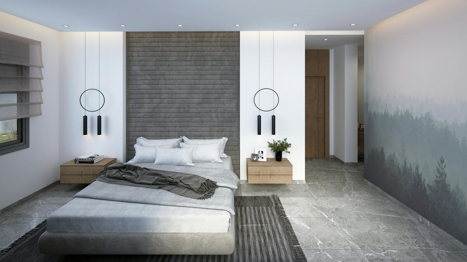
Bedroom curtains: sleep and calm
Bedrooms are where blackout or room-darkening curtains make the biggest difference.
Best options:
- room-darkening for moderate sleepers
- blackout for light-sensitive sleepers or streetlights
- layered: sheer (daytime) + blackout (night)
Bedroom color tip:
- choose softer, calm tones that support rest
- avoid overly busy patterns unless the room is very simple
Dining room curtains: elegance and balance
Dining rooms can handle a slightly more formal curtain look:
- light-filtering for daytime comfort
- fuller curtains for a polished feel
- subtle pattern works well here if the rest of the room is calm
If the dining room feels boxy, curtains can add softness and make it feel more inviting.
Kitchen curtains: practical and clean
Kitchens usually do best with:
- simple shades, or
- shorter curtains in specific window setups,
- lightweight fabrics that are easy to clean.
If you use curtains in the kitchen, keep them practical—kitchens are messy and high-use areas.
Bathroom curtains: privacy and softness
Bathrooms may use window curtains (if there’s a window) that prioritize privacy:
- frosted window film + a light curtain
- moisture-friendly fabrics
- simple tones
For shower curtains:
- keep it within your palette
- consider a fabric liner and a clean, structured look
Step 11: Common curtain mistakes (and how to fix them)
Mistake 1: Hanging the rod too low
Fix: raise it. Higher instantly looks more expensive and makes ceilings feel taller.
Mistake 2: Curtains too short
Fix: choose floor-length or near-floor length. Short curtains often look like they don’t fit.
Mistake 3: Not enough fullness
Fix: add more panels or choose wider panels so curtains drape beautifully.
Mistake 4: Curtains block too much light when open
Fix: extend the rod wider so curtains can stack back off the window.
Mistake 5: Wrong fabric for the room
Fix: choose practical materials for high-use areas and softer textures for cozy rooms.
Step 12: A simple curtain plan you can follow today
If you want a quick, realistic plan:
- Choose the function (light-filtering, blackout, privacy)
- Choose the fabric (texture first)
- Choose a neutral tone that supports your palette
- Measure height and width properly
- Hang the rod higher and wider than the window
- Make sure the panels reach near the floor
- Ensure enough fullness so they don’t look flat
This system will give you that finished look without stress.
Curtains are the “soft architecture” of your home
Curtains aren’t just window coverings—they’re part of the room’s structure. They frame light. They shape proportions. They add warmth and softness. When you treat curtains as a major design layer (like rugs and lighting), your home instantly looks more polished.
If you remember only three things:
- hang them high,
- hang them wide,
- and choose enough fullness.
Those three moves will take your windows from “basic” to “designer” faster than almost anything else.

Isabella Garcia is the creator of a blog dedicated to crafts and home care, focused on making everyday life more creative, organized, and enjoyable. The blog shares practical tips, easy DIY projects, home organization ideas, and simple solutions to take better care of your living space. Whether you’re a beginner in crafting or someone looking for inspiration to improve your home routine, Isabella’s blog offers clear, useful, and hands-on content to help you create a cozy, beautiful, and well-cared-for home.