
Wall art is one of the most personal parts of home decor—and one of the most intimidating. People worry they’ll pick the wrong piece, hang it at the wrong height, spend money and regret it, or end up with a wall that looks messy instead of “designed.” That fear leads to a very common situation: a home that feels almost finished… except the walls are empty.
Here’s the truth: you don’t need to be an art expert to decorate with art well. You need a few practical rules about scale, placement, grouping, and cohesion. Once you understand those, art becomes fun instead of stressful. Art is also one of the best ways to make a home feel more expensive and more “you,” even if the furniture is simple.
This guide will walk you through choosing art, deciding what works for each room, hanging art at the right height, creating gallery walls without chaos, styling art with furniture, and avoiding the most common mistakes.
What wall art actually does in a room
Art isn’t just decoration. It solves real design problems:
- Adds a focal point (so the room feels complete)
- Balances the room visually (especially when furniture is low and walls feel empty)
- Brings color and personality (even in neutral rooms)
- Creates mood (calm, playful, dramatic, cozy, modern)
- Connects rooms (repeating colors or themes creates flow)
If your space feels “unfinished,” it’s often because the walls don’t have enough visual weight. Art fixes that.
Step 1: Decide the role of art in your home
Before you start shopping, decide what you want art to do. There are a few different “art roles,” and knowing yours reduces decision stress.
Role A: Art as mood
You choose art mainly for the feeling it creates: calm landscapes, soft abstracts, warm tones, gentle shapes.
Role B: Art as personality
You choose art that represents your taste and interests: photography, music posters, travel prints, illustrations, meaningful quotes (used sparingly), personal collections.
Role C: Art as design tool
You choose art to solve a design issue: filling a blank wall, connecting colors, adding contrast, or balancing furniture.
Most homes use a mix. The key is picking a direction per room so the walls don’t look random.
Step 2: Start with what you already have (you might have more art than you think)
Before buying anything, gather:
- framed items you already own
- posters or prints you like but never hung
- photos you’ve taken
- postcards or travel pieces
- kids’ art (yes—this can look amazing when framed simply)
Lay them all out on the floor. You may already have:
- a palette you naturally prefer
- a style you keep gravitating toward
- pieces that could work together
Sometimes the biggest “art breakthrough” is realizing you need better placement and framing, not brand-new art.
Step 3: Choose a simple art “thread” to keep things cohesive
Art can be wildly different and still feel cohesive if there’s one connecting thread.
Choose one thread:
- a shared color palette (neutrals + one accent)
- a shared style (photography, abstract, line art)
- a shared frame finish (black, white, wood)
- a shared theme (nature, architecture, typography, travel)
This doesn’t mean everything must match perfectly. It means the home has a visual story.
Easy cohesion approach for beginners
Pick one frame finish for each room (often black or wood), and keep the art palette within a similar mood. This instantly makes things look more intentional.
Step 4: The biggest rule: scale matters more than the art itself
One of the most common mistakes is using art that’s too small. Small art on a large wall looks lost. A room can look expensive quickly when art is properly scaled.
Signs your art is too small
- it looks like a “stamp” floating on the wall
- it doesn’t relate to nearby furniture
- you feel the urge to add random pieces around it to “fill space”
What to do instead
- choose one larger piece
- or group smaller pieces intentionally (gallery wall or pairing)
In many cases, one larger piece looks cleaner than many small pieces.
Step 5: How high should you hang art?
This is the question that causes the most stress—and it’s easier than people think.
The simplest rule for hanging art
Art generally looks best when it’s hung so it relates to eye level and to furniture.
- On an empty wall: hang art so the center feels around eye level.
- Above furniture: hang art so it connects visually to that furniture, not floating too high.
The “floating art” problem
If art is hung too high above a sofa or console, it looks disconnected and awkward. People often do this because they’re afraid of hanging it “too low,” but too high is far more common.
Quick check
Step back across the room. If the art looks like it’s drifting toward the ceiling, it’s too high.
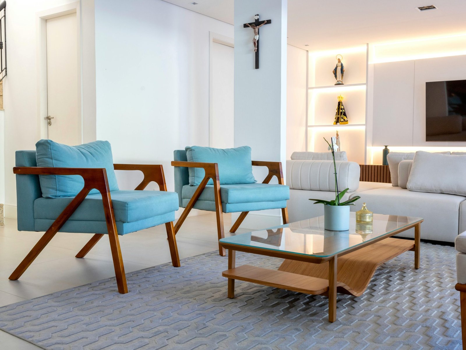
Step 6: Art above furniture: sofa, bed, console, and sideboard rules
Art placement changes depending on what it’s above. Here are reliable guidelines.
Above a sofa
Your goal is to make the sofa wall feel like one intentional composition:
- sofa (base)
- art (visual anchor above)
Ways to do it:
- one large piece centered
- two large pieces side by side
- a set of three in a row (clean and modern)
- a gallery arrangement (only if planned)
Avoid:
- one tiny frame above a big sofa
- hanging art so high it doesn’t connect to the sofa
Above the bed
Beds usually need a strong focal moment above the headboard.
Best options:
- one larger piece
- two symmetrical pieces
- a calm gallery (minimal and cohesive)
Bedroom tip:
Art above the bed should support rest. Busy, chaotic visuals can feel stimulating. Calm colors and simpler compositions often work best here.
Above a console or sideboard
This is one of the easiest places to make your home look designed.
Best options:
- a mirror
- one large piece of art
- two pieces layered or paired (balanced)
Keep the console styling minimal so it doesn’t compete with the art.
Step 7: How to choose art for each room
Living room
Best art direction:
- one strong focal piece or a planned gallery
- art that connects to the room palette
- something with enough scale to anchor the seating zone
Living rooms often handle bolder art because they are social spaces.
Bedroom
Best art direction:
- calming tones (soft neutrals, muted colors)
- simple compositions
- photography or abstracts that feel restful
Bedrooms should feel quieter visually.
Dining room
Best art direction:
- slightly more dramatic (darker tones, bold photography)
- classic themes (still life, landscapes) or modern abstracts
- a mirror or art above a sideboard for elegance
Kitchen
Best art direction:
- small and simple (kitchens clutter easily)
- one or two pieces, not many
- consider leaning art on shelves if you have open shelving (kept minimal)
Bathroom
Best art direction:
- simple prints, calm photography, minimal line art
- moisture-safe frames or protected prints
- one clean focal moment
Hallways
Best art direction:
- a series of pieces in a consistent frame finish
- family photos in cohesive frames
- a gallery line that guides movement
Hallways are perfect for creating flow through repetition.
Step 8: Frames can make cheap art look expensive
Frames are one of the best “upgrade levers” in decor. A simple print can look high-end with the right framing.
How to make framing look intentional
- choose one frame finish for a room (black, white, or wood)
- use mats when appropriate (they create a clean, gallery-like look)
- keep frame styles similar (especially in a gallery wall)
Matte vs. glossy
A lot of “cheap-looking” framing comes from shiny, thin frames and reflective glass. If you want a calmer look:
- choose simple frame profiles
- use consistent finishes
- keep the overall presentation clean
Step 9: Gallery walls that don’t look messy
Gallery walls can look stunning, but they can also look chaotic if there’s no plan.
The key to a clean gallery wall
A gallery wall needs:
- a consistent thread (palette, frame finish, theme)
- a clear boundary (area on the wall it lives in)
- a balanced layout (not scattered randomly)
Two easy gallery wall styles
Style A: Grid-like gallery (clean and modern)
- frames are similar size or arranged evenly
- spacing is consistent
- looks organized and polished
Great for:
- modern homes
- hallways
- office walls
Style B: Organic gallery (collected and cozy)
- frames vary in size
- arrangement feels natural but still balanced
- works best when frames share a finish and the art palette is cohesive
Great for:
- living rooms
- stairs walls
- eclectic homes
Gallery wall mistake to avoid
Adding pieces one by one without a plan. That’s how galleries turn into random collections.
A simple way to plan without stress
Lay the frames on the floor first and test arrangements. Take a photo. Adjust until it looks balanced. This “floor planning” prevents wall regret.
Step 10: How to style art with decor (so it looks intentional)
Art isn’t isolated. It relates to:
- furniture below it
- lighting around it
- decor nearby
Easy styling tools that support art
- a lamp or sconce near the art (adds warmth and highlights the wall)
- a plant nearby (adds organic softness)
- a console with minimal styling (tray + one vase + breathing room)
Avoid placing too many decorative objects right below busy art. The wall and surface can start competing visually.
Step 11: A practical “art buying” strategy (so you don’t waste money)
Art shopping can be overwhelming because there are endless options. Here’s how to do it strategically.
Start with one “hero piece”
Pick one piece you genuinely love for the room that matters most (often the living room). Let that piece guide your palette and mood.
Then build around it:
- choose supporting pieces that echo its colors or style
- keep frames consistent
- use smaller art in secondary spaces
Don’t rush
Empty walls are better than rushed art you don’t love. Art should be personal and intentional. It’s okay to build slowly.
Budget-friendly trick that looks expensive
Buy a print you like and spend your money on better framing. Framing can make the difference between “temporary” and “designed.”
Step 12: The most common art mistakes (and how to fix them)
Mistake 1: Art is too small
Fix: size up, or group pieces intentionally.
Mistake 2: Art is hung too high
Fix: lower it so it relates to eye level and furniture.
Mistake 3: Too many styles and colors mixed randomly
Fix: choose one cohesion thread (palette, theme, or frame finish).
Mistake 4: Gallery wall looks chaotic
Fix: plan layout on the floor first and keep consistent spacing.
Mistake 5: Art competes with cluttered surfaces
Fix: simplify surfaces, use trays, and reduce visual noise.
Mistake 6: Every wall has something
Fix: let some walls breathe. A home looks more elevated when not everything is filled.
Step 13: A simple step-by-step method to get your walls “done”
If you want a stress-free approach, follow this order:
- Pick the room that feels most unfinished (usually living room).
- Choose one hero wall (above sofa, fireplace, or console).
- Decide: one large piece or a planned gallery?
- Choose a palette and frame finish direction.
- Hang the main piece at a balanced height.
- Add supporting pieces only if needed.
- Repeat the frame finish in other rooms for cohesion.
- Leave breathing room—don’t fill every wall.
This prevents over-decorating and creates a home that feels curated.
The real secret: great wall art feels connected to the room
The best art doesn’t feel like an afterthought. It feels connected:
- to the furniture,
- to the palette,
- to the mood,
- and to your life.
If you focus on scale, placement, and cohesion, you can make almost any art look good. And once your walls start feeling intentional, your whole home feels more finished—without adding clutter.
If you want the biggest immediate improvement:
- choose one large piece for your main wall,
- hang it at the right height (not too high),
- and keep the surrounding area calm and clean.

Isabella Garcia is the creator of a blog dedicated to crafts and home care, focused on making everyday life more creative, organized, and enjoyable. The blog shares practical tips, easy DIY projects, home organization ideas, and simple solutions to take better care of your living space. Whether you’re a beginner in crafting or someone looking for inspiration to improve your home routine, Isabella’s blog offers clear, useful, and hands-on content to help you create a cozy, beautiful, and well-cared-for home.