
Choosing colors for your home sounds simple until you’re standing in front of a wall of paint swatches and nothing feels “right.” A shade that looked dreamy on your phone suddenly looks too yellow at home. The “safe” neutral feels bland. The bold color you loved online feels overwhelming in your space.
The truth is: great color palettes aren’t about finding one perfect paint. They’re about building a system that works with your light, your furniture, and the feeling you want each room to have. Once you understand that system, choosing colors becomes easier, faster, and way less stressful.
This guide will walk you through a practical approach to choosing a palette for every room—step by step—so your home feels cohesive, personal, and timeless.
Start With the Mood, Not the Color
Before you pick a single shade, decide how you want each room to feel. Color is emotional. It affects your energy, comfort, and focus.
Try choosing 2–3 mood words for the room:
- Calm, soft, restful
- Bright, fresh, energizing
- Cozy, warm, inviting
- Elegant, moody, sophisticated
- Clean, minimal, airy
These words help you avoid random decisions. They also make it easier to say “no” to colors that don’t match the vibe—even if they’re trendy.
Understand the Big Four: Light, Size, Flow, and Function
A color palette that looks perfect in one home might fail in another. That’s usually because of these four factors.
1) Natural light direction
- North-facing light tends to feel cooler and can make some colors look more muted.
- South-facing light is warmer and brighter; it can make warm colors look more intense.
- East-facing rooms get warm morning light and cooler light later.
- West-facing rooms get strong warm light in the afternoon and evening.
You don’t need to memorize rules. You just need to test colors in your actual lighting (we’ll cover how).
2) Room size
- Lighter colors can help small rooms feel larger.
- Darker colors can make big rooms feel more intimate and dramatic.
- Mid-tones can work anywhere when balanced with light elements.
3) How rooms connect
If your living room flows into your dining area, you want palettes that feel related. They don’t have to match, but they should “make sense” together.
4) Room function
A bedroom usually benefits from calmer colors. A home office may need clarity and focus. A kitchen often looks best in clean, crisp tones.
Function helps you choose colors that support how you live.
Use a Simple Palette Formula That Always Works
If you want a home that looks cohesive, use this formula as your baseline:
- Base color (60%): walls + big visual surfaces
- Secondary color (30%): larger furniture, rugs, curtains, or cabinetry
- Accent color (10%): decor, art, pillows, small objects
This keeps you from overusing accent colors and makes your space feel intentional.
A bonus rule: limit your palette to 3–5 main colors per room (not counting neutrals). Neutrals are your foundation; accents are your personality.
Choose Your Home’s “Anchor Neutral” First
A common mistake is choosing different random neutrals in every room. That often creates a home that feels disconnected.
Pick one anchor neutral that appears throughout your home in some way. It might be:
- A warm white
- A soft cream
- A light greige (gray + beige)
- A gentle light gray
- A muted beige
This doesn’t mean every wall must be the same color. It means you’re building consistency.
If you’re unsure whether you prefer warm or cool neutrals, look at what you already own. If your furniture and decor lean toward:
- Warm woods, tan leather, gold accents → warm neutral works best
- Cool gray fabrics, chrome accents, black and white → cooler neutral may work better
- A mix → a balanced greige can bridge both worlds
Use One “Repeatable Accent” Across the Home
Designers often repeat an accent color in small ways across multiple rooms. This makes your home feel coordinated without being matchy.
Examples of repeatable accents:
- Olive green
- Navy
- Terracotta
- Dusty blue
- Black (as a grounding accent)
- Brass (as a warm metallic accent)
You can repeat it through pillows, art, vases, or even a lamp base. Small repetition creates a polished look.
Build a Palette From Something You Love
If picking colors from scratch feels hard, start from one item you truly like. The best palettes often come from:
- A rug you already own
- A piece of art
- A patterned pillow
- A curtain fabric
- A favorite photo or postcard
Look for 3–4 colors inside that item:
- one neutral base
- one secondary tone
- one or two accents
Then pull your room palette from those.
This is one of the easiest ways to avoid colors that feel random.
Decide Your Undertones (The Secret That Saves You Money)
Many color “fails” happen because undertones clash.
A color can look white, but still have an undertone:
- Warm whites can lean yellow, cream, or peach.
- Cool whites can lean blue, gray, or green.
- Beiges can lean pink, yellow, or green.
- Grays can lean blue, purple, or green.
How to spot undertones fast
Compare your paint sample to something you know is true white (like printer paper). If it suddenly looks yellow, pink, or gray next to it, that’s the undertone.
Why undertones matter
If your sofa is a cool gray and you paint the walls a warm creamy white, they may fight each other. But if you choose a neutral that shares the same temperature, everything feels calmer.
A Practical Way to Choose Wall Colors Without Overthinking
Here’s a method that works reliably:
- Choose your palette (base + secondary + accent).
- Choose 3–5 possible wall colors in your base range.
- Buy sample pots or peel-and-stick samples.
- Test them on multiple walls.
- Observe them morning, afternoon, evening.
Wall paint changes dramatically throughout the day.
The best test trick
Paint samples on poster boards and move them around the room. This keeps your wall clean and helps you compare options in different light.
Room-by-Room Color Palette Ideas (That Work in Real Homes)
Below are practical palette directions by room, plus how to make them feel cohesive.
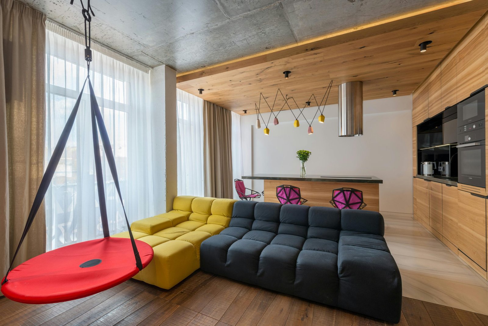
Living Room Palettes: Warm, Welcoming, and Flexible
A living room usually needs to work for multiple purposes: relaxing, entertaining, watching TV, reading, and daily living.
Reliable living room palette ideas
- Warm white + tan + black accents
- Greige + ivory + olive accents
- Soft gray + white + navy accents
- Cream + natural wood + terracotta accents
- Beige + off-white + muted teal accents
How to choose the right one
Ask yourself: do you want the room to feel brighter or cozier?
- Brighter → lighter base + clean accents
- Cozier → warmer base + deeper accents
Quick tip for balance
If your sofa is dark, keep walls lighter. If your sofa is light, you can go a bit deeper on walls or add stronger accents.
Bedroom Palettes: Calm, Soft, and Restful
Bedrooms tend to look best when colors feel soothing and not overly loud.
Reliable bedroom palette ideas
- Soft warm white + oatmeal + muted green accents
- Cream + dusty blue + warm wood
- Light greige + white + charcoal accents
- Pale taupe + blush accents + brass details
- Warm gray + off-white + navy accents
Easy way to make a bedroom feel “hotel-like”
Use a quiet wall color, then add texture through bedding:
- layered neutrals
- soft throws
- structured pillows
- gentle lighting
In bedrooms, texture is often more important than bold color.
Kitchen Palettes: Clean, Bright, and Timeless
Kitchens have hard surfaces (tile, counters, cabinets), so color choices should feel clean and easy to live with.
Reliable kitchen palette ideas
- White cabinets + warm wood + black hardware
- Cream cabinets + beige walls + brass hardware
- Light gray cabinets + white walls + black accents
- Soft sage cabinets + white walls + wood accents
- Neutral cabinets + subtle blue-gray walls + stainless accents
Quick kitchen rule
Choose one strong “feature” direction:
- cabinets
- backsplash
- countertop
If everything is competing, the kitchen can feel busy. If one element leads, it feels designed.
Bathroom Palettes: Fresh and Flattering
Bathrooms can handle a bit more contrast because they’re smaller. But you still want the palette to feel clean.
Reliable bathroom palette ideas
- White + light gray + black accents
- Cream + warm stone + brass accents
- White + sage + natural wood
- Soft blue-gray + white + chrome accents
- Beige + white + matte black accents
Tip that makes bathrooms feel expensive
Keep the palette simple and upgrade with:
- nicer towels
- a framed mirror
- warm lighting
- a tray with a few neatly chosen items
Home Office Palettes: Focus Without Feeling Cold
A home office should help you concentrate, but still feel comfortable.
Reliable home office palette ideas
- Warm white + wood + black accents
- Light greige + white + deep green accents
- Soft gray + white + navy accents
- Cream + muted blue + brass accents
Focus tip
If you’re on video calls, avoid intense colors directly behind you. A calm neutral wall with one piece of art usually looks best.
Kids’ Rooms: Playful but Not Chaotic
You can use color here, but a strong system keeps it from becoming overwhelming.
Easy approach
Choose:
- one base neutral
- one main color
- one secondary accent
Examples:
- Warm white + dusty blue + mustard accents
- Cream + soft green + terracotta accents
- Light gray + blush + navy accents
Use color in:
- bedding
- art
- storage bins
- rugs
This keeps paint flexible as the room evolves.
Hallways and Entryways: The Glue of the House
Transitions matter. If your entryway and hallway feel cohesive, your home looks more connected.
Palette idea
Use the anchor neutral on walls and add contrast through:
- a runner rug
- framed prints
- a console
- a lamp
If you want drama, a deeper color can look amazing in an entryway—just balance it with light and mirrors.
How to Make Open-Concept Spaces Feel Cohesive
Open-concept homes can look messy when every zone has its own unrelated palette.
Use a “shared elements” strategy:
- same wall color across the whole space
- repeated accent color in multiple zones
- consistent metal finishes (black, brass, or chrome)
- consistent wood tone direction
Then differentiate zones with:
- rugs
- lighting
- art
- textiles
This gives you variety without chaos.
Warm vs Cool: The Fastest Way to Choose Correctly
If you’re stuck, this simple guide helps.
Warm palettes feel:
Cozy, inviting, soft, relaxed
Common warm colors:
- warm white, cream
- beige, camel
- terracotta, rust
- olive, warm greens
- warm browns
Cool palettes feel:
Clean, crisp, modern, airy
Common cool colors:
- cool white, crisp white
- cool gray
- navy, deep blue
- blue-gray
- some cooler greens
Neither is “better.” The right choice depends on your light and what you own already.
The Most Common Palette Mistakes (And How to Fix Them)
Mistake 1: Too many colors
Fix: choose one palette and limit accents.
Mistake 2: Undertones clash
Fix: compare samples to your floors, sofa, and countertop. Pick colors that share a similar temperature.
Mistake 3: Everything is the same tone
A room can feel flat if everything is light or everything is mid-tone.
Fix: add contrast with black, wood, or deeper accents.
Mistake 4: Paint first, furniture later
It’s usually easier to pick paint after you know your big pieces.
Fix: pull paint from your rug, sofa, or art.
Mistake 5: Ignoring lighting
Fix: test samples at different times of day.
How to Create a “Designer” Palette in 10 Minutes
Try this quick exercise:
- Choose one inspiration photo you genuinely like.
- Identify:
- wall color (base)
- furniture color (secondary)
- accent colors (2 max)
- Add one metal finish (black, brass, or chrome).
- Add one wood tone direction (warm, neutral, or cool).
- Repeat at least one accent color somewhere else in the room.
This creates a complete plan, not just a paint choice.
A Simple Shopping and Styling Plan Based on Your Palette
Once your palette is chosen, decorating becomes easier.
- Buy textiles first (rug, curtains, pillows).
- Add lighting (lamps and warm bulbs).
- Add 1–2 pieces of wall art that include your accent colors.
- Add texture in neutral tones (throws, baskets, ceramics).
- Keep accents controlled so the room stays calm.
A palette isn’t just paint. It’s the whole visual system.
The Final “No-Regret” Checklist
Before you commit, ask:
- Does this color palette match how I want the room to feel?
- Does it work with my floors and big furniture pieces?
- Are undertones consistent (warm with warm, cool with cool)?
- Do I have a clear base, secondary, and accent plan?
- Does it connect with the rooms nearby?
If you can answer “yes” to most of these, your palette will feel right—not just today, but long-term.
When you choose color with a system instead of guessing, your home starts to look more cohesive naturally. You’ll waste less money, make faster decisions, and enjoy the process a lot more.

Isabella Garcia is the creator of a blog dedicated to crafts and home care, focused on making everyday life more creative, organized, and enjoyable. The blog shares practical tips, easy DIY projects, home organization ideas, and simple solutions to take better care of your living space. Whether you’re a beginner in crafting or someone looking for inspiration to improve your home routine, Isabella’s blog offers clear, useful, and hands-on content to help you create a cozy, beautiful, and well-cared-for home.