
Choosing wall paint feels like it should be simple—until you’re standing in front of a wall of paint swatches and suddenly every “nice neutral” looks the same. Then you bring samples home, and what looked perfect in the store turns weird: too pink, too yellow, too gray, too dark, too sterile. Paint is one of the most emotional (and frustrating) design decisions because it covers a huge surface and changes dramatically with lighting.
The good news is that you can avoid most paint regret with a practical method. Designers don’t pick paint by falling in love with one tiny swatch. They pick it by understanding undertones, testing properly, and choosing paint to support the room’s fixed elements—floors, cabinets, furniture, and light.
This guide will give you a clear step-by-step system to choose wall paint colors confidently, whether you want a clean white, a warm neutral, a soft color, or a bold statement.
Why paint looks different everywhere (and why swatches lie)
Paint is affected by:
- Natural light direction (north, south, east, west)
- Time of day (morning vs. evening)
- Artificial lighting (warm vs. cool bulbs)
- Surrounding colors (floors, furniture, rug, cabinets)
- Finish (matte vs. satin changes reflectivity)
A paint color is never just “beige.” It’s beige plus your room’s lighting and surrounding materials.
That’s why a color that looks perfect in one house can look completely wrong in another.
Step 1: Start with what you can’t change (the “fixed elements”)
Before you look at paint, look at your fixed elements—the things that won’t change easily:
- flooring (wood, tile, carpet)
- kitchen cabinets
- countertops
- large furniture pieces
- built-in trim or stone
Your paint should support these elements, not fight them.
Quick example
If your floors are warm-toned wood, very cool gray paint can make the floors look orange (because cool paint emphasizes warm tones). If your countertops have a cool undertone, very warm paint can make them look dull or yellowed.
Paint is a supporting actor, not the lead. Let the fixed elements guide your direction.
Step 2: Identify your undertone direction (warm, cool, or balanced)
Undertones are the hidden color shifts that show up once paint is on the wall.
Warm undertones
Lean toward:
- cream, beige, warm whites
- hint of yellow, red, or orange
Best for: - cozy homes
- warm wood floors
- warm lighting vibes
Common regret: - looks “yellow” in some lighting if you choose too warm
Cool undertones
Lean toward:
- crisp whites, cooler grays
- hint of blue, green, or violet
Best for: - modern, clean interiors
- cooler flooring or stone
Common regret: - looks icy, flat, or “hospital” in low light
Balanced / neutral undertones
Lean toward:
- greige (gray-beige), soft off-whites
- minimal color pull
Best for: - most homes, especially if you want flexibility
Common regret: - can still pull green/purple depending on the room, so testing matters
The easiest way to decide undertone direction
Look at your floors and large furniture:
- If you see a lot of warmth (golden wood, creamy tones), start with warm or balanced neutrals.
- If you see cooler elements (gray tile, cool stone), start with cool or balanced neutrals.
- If you have a mix, balanced neutrals are usually safest.
Step 3: Choose the “paint job” of the room (what should paint do?)
Different rooms need paint to do different jobs.
Ask:
- Do you want the room to feel bigger and brighter?
- Do you want it to feel cozy and grounded?
- Do you want it to feel clean and modern?
- Do you want it to feel calm and soft?
Paint is a mood tool. Knowing the job prevents random choosing.
Paint direction by goal
- Brighter/bigger: light tones, lower contrast, soft neutrals
- Cozy: warmer neutrals, muted earthy colors, less stark white
- Modern/clean: crisp neutrals, controlled contrast, cooler or balanced whites
- Calm: muted colors (sage, dusty blue), soft greige, gentle tone-on-tone
Step 4: Narrow down to 3–5 candidate colors (not 25)
Most paint regret happens because people test too many options and get overwhelmed.
Instead:
- pick 3–5 options max
- all in the same undertone family
- and ideally similar depth (lightness/darkness)
If you mix warm and cool candidates, you’ll confuse your eye and make the decision harder.
The “family rule”
Choose one family:
- warm white family
- balanced off-white family
- greige family
- soft color family (muted blue, muted green, etc.)
Then test within that family.
Step 5: Test paint the right way (so you don’t get tricked)
Testing is everything. But most people test incorrectly.
The right way to test
- Test on large areas, not tiny swatches.
- Use at least two walls (different light exposure).
- Test at multiple times of day.
If you can, paint large sample rectangles or use large sample boards and move them around the room.
Why small samples fail
A tiny patch doesn’t show how the color interacts with light across a full wall. It also doesn’t show how the color shifts when the room changes from daylight to evening.
Test in context
Paint will look different next to:
- your flooring
- your sofa fabric
- your cabinets
- your countertops
- your trim color
Testing is about seeing the color with your real materials, not in isolation.
Step 6: Pay attention to LRV (light reflectance value)—without obsessing
LRV is basically how much light a paint reflects. Higher LRV = brighter. Lower LRV = deeper.
You don’t need exact numbers, but here’s the practical takeaway:
- Higher LRV can make rooms feel brighter and more open.
- Lower LRV can feel cozy and dramatic, but may darken a room.
When LRV matters most
- rooms with little natural light
- north-facing rooms (often cooler and dimmer)
- small rooms you want to feel bigger
In low-light rooms, even a “light” color can look darker than you expect. That’s why testing is important.
Step 7: Understand how room direction affects paint
You don’t need to be an expert. You just need the basic behavior.
North-facing rooms
- cooler, softer light
- warm paint helps prevent the room from feeling cold
- cool paint can look extra gray or flat
South-facing rooms
- warmer, stronger light
- cool or balanced paint can look great
- warm paint may look more yellow than expected
East-facing rooms
- bright, warm morning light
- cooler in the afternoon
- test across the day to see shifts
West-facing rooms
- more neutral earlier
- warm and strong in late afternoon/evening
- some colors can look intense at sunset hours
This isn’t about rules—it’s about awareness. Lighting direction explains why a paint shifts so much.
Step 8: Decide what you’re doing with trim (this affects wall color)
Trim color changes how wall color reads.
You have two common approaches:
1) Crisp trim contrast
- brighter or cleaner trim color
- walls slightly deeper or warmer
This creates a clean, classic look.
2) Soft tone-on-tone
- trim and walls in similar tones
- lower contrast
This makes rooms feel calmer and can make spaces feel larger and more modern.
Common mistake
Choosing a very bright “cool” white trim with a warm wall color can make the walls look more yellow than they actually are. If you want warm walls, choose a trim that also has a compatible warmth.
Step 9: Consider paint finish (it changes the look)
Paint finish affects:
- how much light bounces
- how much wall texture shows
- how washable it is
General guideline:
- Matte/flat: soft, elegant, hides wall imperfections, less washable
- Eggshell: a good everyday choice for most walls (balanced)
- Satin: more durable, slightly shinier, shows more texture
- Semi-gloss: often used on trim, more shine
If you want a calm, high-end look, matte or eggshell is often preferred on walls. Shinier finishes can make walls feel harsher because they reflect more light.
Step 10: Avoid the most common paint regrets (and how to prevent them)
Regret 1: “It looks too gray”
Cause:
- cool lighting, north-facing room, cool undertone paint
Fix: - test warmer or more balanced options, and improve lighting warmth
Regret 2: “It looks too yellow”
Cause:
- too-warm undertone, strong warm sunlight, warm bulbs
Fix: - choose a more balanced off-white or greige instead of a creamy color
Regret 3: “It looks pink/purple”
Cause:
- undertone shift, reflected colors from floors or furniture
Fix: - try a different neutral in the same family; test beside flooring
Regret 4: “It looks green”
Cause:
- some greiges and off-whites have a green undertone that appears in certain light
Fix: - choose a more neutral greige or a warmer option; test in multiple spots
Regret 5: “It’s darker than I expected”
Cause:
- low light, low LRV, too much contrast
Fix: - go one shade lighter than you think in low-light rooms
Step 11: A practical paint selection process (the full method)
Here’s the step-by-step method you can follow:
- Identify your fixed elements (floors, cabinets, furniture).
- Decide your undertone direction (warm, cool, balanced).
- Decide the room mood goal (bright, cozy, calm, modern).
- Choose 3–5 candidate colors in the same family.
- Test large samples on 2+ walls.
- View samples morning, afternoon, night (with your lights on too).
- Choose the color that looks “right” in the widest range of conditions.
- Confirm trim coordination (contrast or tone-on-tone).
- Choose finish based on your room needs (eggshell is often safe).
This method prevents most regret because it removes guesswork.
Step 12: Room-by-room paint guidance (so you don’t overthink)
Living room
Goal: warm, welcoming, flexible
Great choices:
- balanced off-whites
- light greiges
- soft warm neutrals
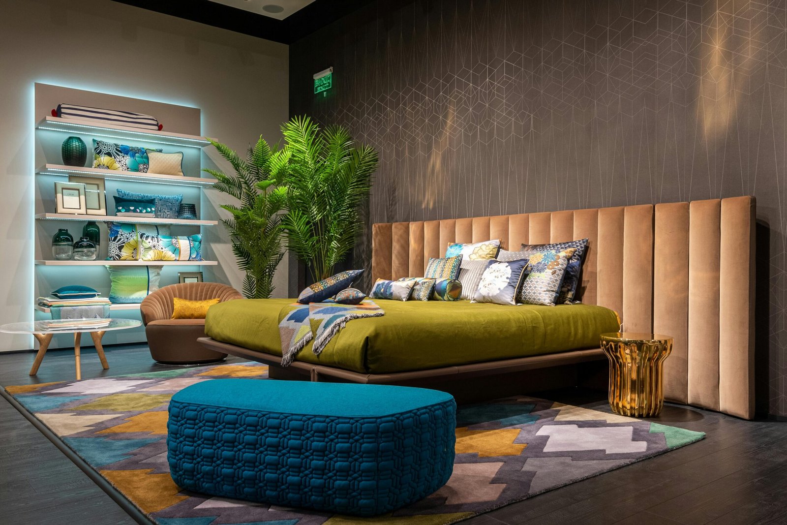
Bedroom
Goal: calm, restful
Great choices:
- muted blues, sage greens, soft warm neutrals
- tone-on-tone looks especially relaxing here
Kitchen
Goal: clean but not cold
Great choices:
- soft whites and light neutrals that support cabinets and countertops
- avoid choosing a wall color that fights the countertop undertone
Bathroom
Goal: fresh and spa-like
Great choices:
- clean whites, soft neutrals, muted greens/blues
- choose a tone that works with tile and fixtures
Hallways
Goal: continuity and brightness
Great choices:
- the same base neutral used throughout the home
- a light tone that transitions well into other rooms
A consistent neutral across halls and shared spaces helps the home feel cohesive.
Step 13: What if you want bold color?
Bold paint can be amazing, but the method still applies.
If you want bold:
- choose one wall or one room where you want the drama
- make sure the rest of the palette supports it
- test it even more carefully (bold colors shift strongly with light)
Bold works best when it’s intentional and balanced with calmer elements.
The real secret: choose paint based on your home, not a photo
Paint inspiration photos are helpful, but they can mislead you because you don’t have the same:
- natural light
- furniture
- flooring
- trim color
- camera editing and filters
To avoid regret, treat photos as mood inspiration—not as a guarantee that the exact same color will look the same in your house.
If you follow the practical method—fixed elements, undertones, a small shortlist, and proper testing—you’ll choose a paint color that looks good in real life, in your real lighting, and with your real materials.

Isabella Garcia is the creator of a blog dedicated to crafts and home care, focused on making everyday life more creative, organized, and enjoyable. The blog shares practical tips, easy DIY projects, home organization ideas, and simple solutions to take better care of your living space. Whether you’re a beginner in crafting or someone looking for inspiration to improve your home routine, Isabella’s blog offers clear, useful, and hands-on content to help you create a cozy, beautiful, and well-cared-for home.