
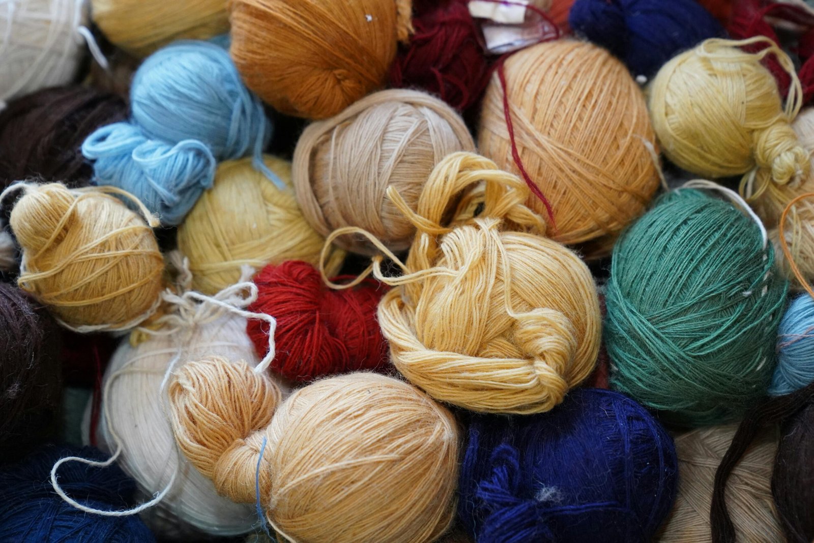
Choosing colors is one of the most enjoyable parts of starting a knitting project. Before the first stitch is even made, the colors already help define the mood, style, and personality of the piece. A simple scarf can look classic, cheerful, modern, cozy, delicate, or bold depending on the yarn colors you choose.
For beginners, however, color choice can feel confusing. There are so many shades available that it is easy to feel unsure. You may love a color in the skein but later realize it does not look the way you imagined in the finished piece. You may also choose two beautiful colors separately, only to find that they do not work well together in the same project.
The good news is that choosing colors for knitting does not need to be complicated. With a few simple principles, you can make better decisions and create pieces that look harmonious, pleasant, and well planned.
Think About the Purpose of the Project
Before choosing yarn colors, think about what you are making. The purpose of the piece can guide your color decision.
A blanket for a living room may look better in colors that match the decoration of the space. A scarf for daily use may be more practical in neutral tones that combine with many outfits. A baby blanket may look sweet in soft colors, while a decorative pillow can be more colorful and playful.
Ask yourself where the piece will be used, who will use it, and what feeling you want it to create. A cozy winter shawl may call for warm shades like cream, brown, rust, or deep red. A light spring accessory may look better in soft green, lavender, pale yellow, or sky blue.
When the project has a clear purpose, color choice becomes easier.
Start With Colors You Already Like
One of the simplest ways to choose beautiful colors is to begin with shades you naturally enjoy. If you are drawn to blues, greens, earthy tones, or soft neutrals, use that as your starting point.
Knitting takes time. You will spend many hours looking at the yarn while working on the project. Choosing a color you truly like makes the process more pleasant.
However, liking a color does not always mean it is the best choice for every project. A very bright color may be fun for a small accessory but overwhelming for a large blanket. A delicate pastel may look beautiful in a baby piece but may not have enough impact in a textured pattern.
Use your personal taste as a guide, but also consider the size, style, and use of the project.
Understand Warm and Cool Colors
A helpful way to think about color is to separate shades into warm and cool groups.
Warm colors include red, orange, yellow, rust, mustard, peach, coral, and many browns. They often create a feeling of energy, warmth, comfort, and coziness.
Cool colors include blue, green, purple, mint, teal, and some gray tones. They often feel calm, fresh, peaceful, or elegant.
This does not mean one group is better than the other. It simply helps you understand the mood of your project. A blanket in warm colors may feel inviting and cozy. A scarf in cool colors may feel calm and refined.
You can also combine warm and cool colors, but it helps to choose one side as the main direction. If you use too many unrelated shades, the result may feel confusing.
Use Neutral Colors as a Safe Base
Neutral colors are very useful in knitting. They include white, cream, beige, gray, black, brown, and soft natural tones.
Neutrals work well because they combine easily with other colors. They can make a piece look classic, clean, and versatile. They are also helpful when you want the stitch pattern to stand out.
For example, a textured cardigan in cream yarn may show cables and stitches clearly. A gray scarf can be used with many outfits. A beige blanket can fit into different room styles without looking too busy.
Neutral colors are also great when combining multiple shades. If you are unsure about using bright colors, try adding one strong color to a neutral base. A cream and forest green combination, for example, can look balanced and elegant.
Choose One Main Color First
When working with more than one color, start by choosing one main color. This will be the dominant shade in the project.
The main color should be the one that appears most often or defines the overall look. Once you choose it, you can select supporting colors that match it.
For example, if your main color is navy blue, you might add cream, light gray, or mustard. If your main color is dusty pink, you might add ivory, warm beige, or soft brown.
Choosing the main color first prevents the project from feeling random. It gives you a clear direction and makes it easier to build a color palette.
Limit the Number of Colors
Using many colors can be beautiful, but it can also become overwhelming if there is no balance. For beginners, it is often easier to work with two to four colors.
A two-color project can look clean and elegant. Three colors can create more depth while still being simple. Four colors can work well when they share a similar tone or style.
If you want to use many colors, try choosing shades from the same family. For example, different tones of blue can create a calm gradient effect. Earthy shades like brown, beige, olive, and rust can create a natural and cozy look.
Limiting the number of colors helps the finished piece look more intentional.
Pay Attention to Contrast
Contrast is the difference between light and dark colors. It is especially important in knitting patterns with stripes, color blocks, fair isle, or any design where you want the colors to stand apart.
If two colors are too similar, the pattern may disappear. For example, light gray and pale blue may look beautiful together, but a detailed pattern may not show clearly if the contrast is too low.
To test contrast, place the yarns side by side. Step back and look at them from a distance. If you can still see the difference clearly, the contrast is probably strong enough.
Another simple trick is to take a photo of the yarns and view it in black and white. If the shades look almost the same in black and white, they may not have enough contrast for a pattern that needs definition.
Consider the Stitch Pattern
The stitch pattern can change how colors appear. Some patterns look best in solid colors, while others work beautifully with variegated or multicolored yarns.
If the project has many details, such as cables, lace, or textured stitches, a solid or lightly heathered yarn may show the design better. Very busy yarn can hide the stitch work.
On the other hand, simple stitches like garter stitch or stockinette can be a great base for colorful yarn. Since the stitch pattern is simple, the yarn color becomes the main attraction.
Before choosing a color, look at the project pattern. Ask whether the color should highlight the stitches or become the focus itself.
Be Careful With Variegated Yarn
Variegated yarns are yarns that contain several colors in one skein. They can be beautiful and exciting, especially when the colors change naturally as you knit.
However, they can also be unpredictable. The way the colors appear in the skein may be different from how they appear in the finished piece. Depending on the project size and stitch count, colors may pool in certain areas or create unexpected patterns.
For beginners, variegated yarn is often easier to use in simple projects. Scarves, shawls, and basic hats can work well because the yarn itself adds interest.
If the knitting pattern is already complex, a variegated yarn may make it look too busy. In that case, a solid color may be a better choice.
Match Colors to the Season
Seasonal inspiration can help you choose colors more easily.
For autumn projects, shades like rust, mustard, olive, chocolate brown, burgundy, and cream can create a warm and cozy feeling. For winter, deep colors like navy, charcoal, forest green, wine, and soft gray often work beautifully.
Spring projects may look lovely in pastel shades, fresh greens, soft pinks, lilac, and light yellow. Summer-inspired pieces can use white, sand, aqua, coral, and other fresh colors.
You do not have to follow seasonal colors strictly, but they can be a helpful starting point when you feel stuck.
Think About Who Will Use the Piece
If you are knitting something for yourself, choose colors that match your taste, wardrobe, or home. If the piece is a gift, think about the person who will receive it.
Some people love bright colors. Others prefer simple neutrals. Some enjoy soft romantic shades, while others like dark and classic tones.
A handmade piece feels even more special when the colors match the person’s style. If you are unsure, neutral colors are usually safer for gifts. Gray, cream, navy, beige, and soft earth tones tend to be easier to use and combine.
For decorative gifts, consider the colors of the person’s home. A blanket or pillow should look good in the space where it will be used.
Test Colors Before Starting a Large Project
Before beginning a big knitting project, it is a good idea to make a small sample. This is often called a swatch.
A swatch helps you see how the colors look when knitted. Yarn can appear different in a skein than it does in fabric. The texture, stitch pattern, and lighting can all change the final look.
If you are combining colors, a swatch shows whether they work well together. It can also reveal whether one color is too strong, too pale, or not visible enough in the pattern.
Testing may feel like an extra step, but it can prevent disappointment later, especially in large projects like blankets, sweaters, or shawls.
Look for Inspiration Around You
Inspiration for color combinations can come from many places. Look at nature, home decoration, clothing, flowers, landscapes, paintings, and even your favorite objects.
A beach scene may inspire a palette of sand, white, soft blue, and sea green. A forest walk may inspire olive, brown, moss, and cream. A cup of coffee with a warm blanket may inspire beige, caramel, chocolate, and ivory.
You can also look at your wardrobe. The colors you wear often are usually colors you feel comfortable with. This is helpful when knitting accessories or clothing.
Inspiration does not mean copying exactly. It means noticing combinations that already feel beautiful and adapting them to your project.
Use Color Families for Harmony
A very easy way to create harmony is to choose colors from the same family. This means using different shades of the same color.
For example, you can combine light blue, medium blue, and navy. Or you can use pale pink, rose, and burgundy. These combinations usually look elegant because the colors are related.
This approach works well for blankets, scarves, shawls, and decorative pieces. It creates depth without looking too busy.
You can also create a gradient effect by arranging colors from light to dark. This gives the project a soft and organized appearance.
Trust Simple Combinations
Beautiful knitting projects do not always need complicated color palettes. Simple combinations can be just as impressive.
Cream and navy can look classic. Gray and pink can look soft and modern. Beige and brown can feel natural and cozy. White and green can look fresh. Black and camel can look elegant.
If you are unsure, choose a simple combination and focus on good execution. Clean stitches, nice texture, and careful finishing can make even the simplest colors look beautiful.
Sometimes, less really is more.
A Thoughtful Color Choice Makes the Project Shine
Choosing beautiful colors for knitting is a mix of personal taste, project purpose, contrast, harmony, and practical thinking. You do not need to follow strict rules, but a few simple principles can help you avoid combinations that feel confusing or disappointing.
Start with one main color, think about where the piece will be used, limit the number of colors, and test your choices when possible. Consider the stitch pattern, the season, and the person who will use the finished piece.
Over time, choosing colors becomes easier. You begin to notice what works, what you enjoy, and what kind of mood each palette creates.
The best color choice is not only the one that looks good in the skein. It is the one that makes the finished project feel complete, beautiful, and enjoyable to use.

Isabella Garcia is the creator of a blog dedicated to crafts and home care, focused on making everyday life more creative, organized, and enjoyable. The blog shares practical tips, easy DIY projects, home organization ideas, and simple solutions to take better care of your living space. Whether you’re a beginner in crafting or someone looking for inspiration to improve your home routine, Isabella’s blog offers clear, useful, and hands-on content to help you create a cozy, beautiful, and well-cared-for home.